


Virgils
Benchmarking, logo, visual identity, website design, copywriting, illustration, and social assets
Collaboration with Art Director & Illustrator Eleonore Bem
Virgils is a VR platform for therapists.
They offer boys ages 11-13 in the pilot the opportunity to embark on an epic quest with a group of companions where the hero returns transformed. The experience is one of powerful play where agency is felt and the boys (and eventually she/her/they when the pilot expands) get to reframe their past story as well as craft the next part of their narrative.
The company believes in the idea of building bridges back to reality through virtual reality and the rebrand is firmly anchored in the idea of the hero’s journey.
The principal typography harkens back to the original type used in the publication of Dante’s Inferno. The body typography is serious enough to speak to the parents of a prospective adoles- cent client, a therapist, and an adolescent client. The sans serif and the serif bring together the past and the present in a clean digital dialogue.
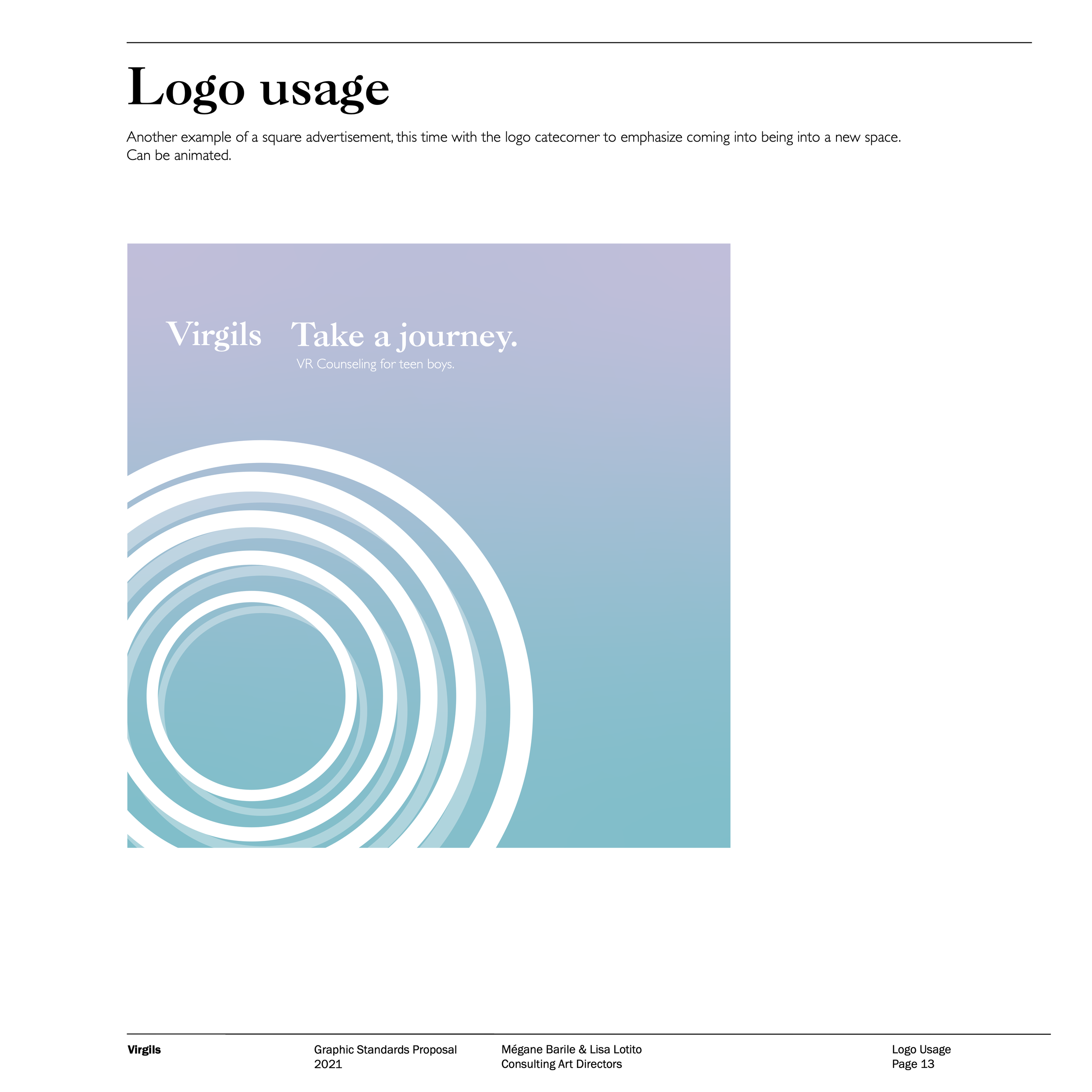
The color palette is taken from the 8 nebulas closest to earth, which recall the ideas of entropy (chaos), enthalpy (energy), growth, expansion, and rebirth. The gradients speak to the idea of the liminal space, and the colors are modern. The color combination is gender inclusive.
The Virgils rebrand stands out among competitors and presents the company as a safe, innovative solution to the growing mental health crisis among global youth.